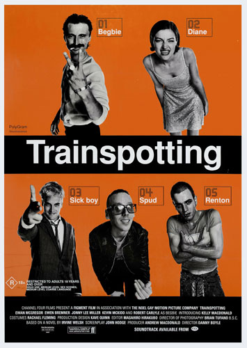
1) All 5 main characters have an equal visual layout above and below the film title.
2) Ewan McGreggor is the biggest A list star in this movie, and is therefore made quite obvious within the poster, to attract fans of his to see the film.
3)The film is directed by Danny Boyle, who is included within the poster, but not made too obvious as he is not a selling point of the film.
4)'Trainspotting' is the largest text on the poster, its placed in the centre of the poster, to draw the most attention. It is displayed in a bold font to be made even more obvious.
5)The harsh black and orange colour palette that has been used here is also a eye catching element to the film. Its very bold which promotes the fact that the film is very bold and touches on serious subjects.
6)The use of the black and white newspaper theme for imagery promotes a dated feel to the film, suggesting its set later than the present.
7)The way that the characters are dressed also adds a very dated theme for the poster. The males are looking very typical of the 80's as is the female.
8)The text at the bottom of the poster clearly states that it is a channel 4 production. This is a unique selling point for the film as many people are fans of channel 4 productions and will want to see the film purely for the fact they enjoy their other films.
9)The way that the characters are posed suggests that they are out causing trouble, or they've got themselves into a bit of mess. The way that one of the men has his fingers in the shape of a gun, promotes a very violent mood.
10)The poster and the film its self does not have a 'tag line' to sell itself, this tells me that the film speaks for itself and in a way makes me want to see the film even more, it holds an intriguing element that appeals to most people.
11) The small print at the bottom of the poster is clear but not large, although the names of directors and editors are high lighted in bold and made more apparent.

